


In order to ensure that your leaflets, or any other printed product, are good quality and appear bright and clear there are certain basic design and printing-related elements to be aware of. Let us start off with a quick intro to set the scene. First of all, many of you might wonder “Why does it matter if my artwork is 300 DPI or not?” or even “300 DPI...what are they talking about?”. Don’t worry, for someone who does not work in the industry such terminology might seem foreign.
What is DPI?
In the printing field, ‘DPI’ is short for ‘Dots Per Inch’. This value refers to the number of dots that are printed per inch. It is therefore needless to say, the higher the DPI value, the higher the printed dot density, and the higher the resolution (‘less pixelated’). Depending on what you are printing, this knowledge might be very useful. Any images, including logos in your artwork, need to satisfy a minimum DPI threshold in order for the final print to be majestic. Just because these visuals might look awesome on your laptop does not mean this will be the case once printed.
Does the colour mode matter?
The simple answer? Yes, it absolutely does. But let's delve a bit deeper.
Colour mode, or colour space, is a specific organization of colours. In graphic design and printing, the two most common colour modes are RGB (Red, Green, and Blue) and CMYK (Cyan, Magenta, Yellow, and Black). Each mode has its specific use and application, and choosing the right one can significantly impact the outcome of your printed materials.
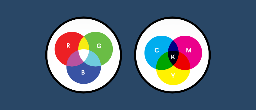
When you look at images or videos on screens, such as your computer monitor, smartphone, or television, you're typically viewing in RGB. This mode is ideal for digital displays because these devices emit light in these three primary colours to create the vast spectrum of colours you see on-screen.
On the other hand, CMYK is the colour mode used by printers. Instead of emitting light, printers use a combination of inks in these four primary colours to reproduce the image on paper or other materials. For this reason, if you're preparing an image or design for printing, it's crucial to use the CMYK mode. Doing so ensures that the colours you see on your screen more closely match what's printed. The RGB mode, while perfect for on-screen viewing, can produce unexpected and often less vibrant results when sent to print.
In summary, if you're after bright, true-to-design colours on your printed materials, you'll want to stick with the CMYK colour space. While RGB has its merits in digital mediums, for print files, CMYK is the way to go. Even so, we will not go into greater detail on this matter, but, you are welcome to read our blog entry on the topic here, where you will learn everything you need to know.
Why is 300 DPI the minimum DPI for artwork if you want a good printing outcome?
Well, the answer to this might seem obvious since higher DPI means increased detail. Let me just make it easy for you and give you an example. Please direct your attention to the image below. Let’s just get a little bit more into detail. Simply put, images can be one of two types: bitmap images or vector images.
Bitmap images are stored as a series of tiny dots called pixels. These pixels are arranged together in a pattern to form an image. When you zoom into the image you will eventually start seeing the individual pixels that make up the image.
Vector images are not based on pixels, but on mathematical formulas that draw certain lines and curves. When you zoom into a vector image, it is just as sharp as the image in its original size.
To ensure the sharpness of bitmap images, one should check the resolution (DPI) of the bitmap images in the artwork.
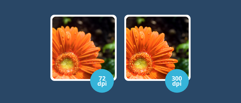
Spot the difference?

As the DPI increases from left to right, so does the clarity of the image. When printing any visual, it is important to use images with a DPI of 300 or higher to avoid any nasty surprises upon receiving printed artwork.
How can I easily check my artwork’s DPI level?
Don’t worry, there are various ways to determine the DPI of your artwork. The easiest way is to use Paint. Open your artwork in Microsoft Paint and then locate the Properties section for this artwork.
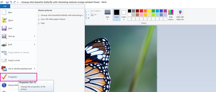
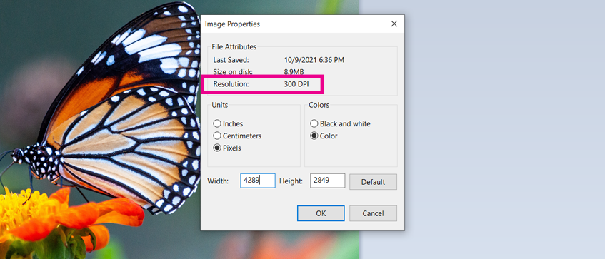
As you can see when viewing the Image Properties, this image is 300 DPI. Hence it meets the minimum requirements necessary for printing your artwork and you can therefore proceed with designing your artwork and placing your intended order.
Alternatively, if you are an avid user of Adobe Illustrator, then here is a good step-by-step description of how to check your artwork’s DPI within the program.
Importance of Image Resolution DPI
When we look at images on our computer screens, many monitors display at around 96 DPI. This might be sufficient for viewing on digital devices, but once printed, the limitations become evident. An image at 96 DPI, when printed, might appear blurred, pixelated, and lacking in detail. It's akin to watching a standard-definition video on a high-definition screen; the flaws become glaringly apparent.
On the other hand, 300 DPI would yield a much better result for high-resolution printing. At this resolution, the printed images are sharper, more vibrant, and richer in detail. The stark difference between a 96 DPI and a 300 DPI print is easily noticeable, even to the untrained eye. While the 96 DPI print may have a mosaic of visible squares (pixels) muddling the image, the 300 DPI print showcases the image as intended: crisp, clear, and professional.
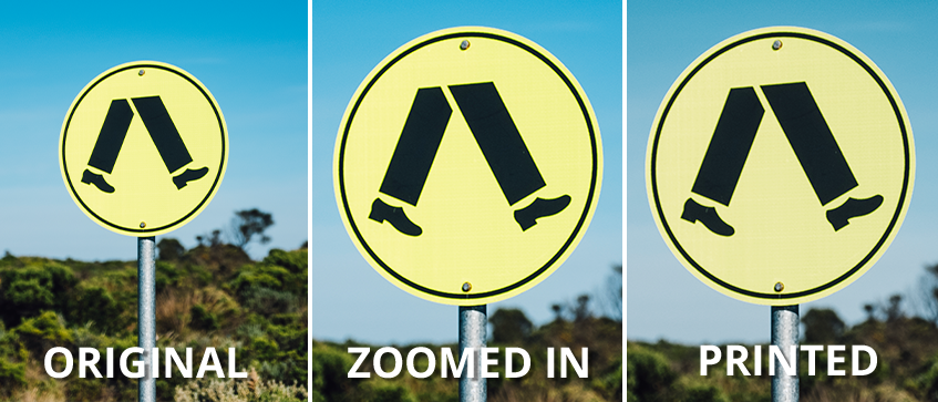
In case you do not yet appreciate the importance of ensuring that your artwork is at least 300 DPI, here is another example to show you the difference in final outcome. Below are two pictures of street signs. At first glance, both Picture A (96 DPI) and Picture B (300 DPI) appear to be clear in terms of resolution. However, don’t be fooled! Zooming in on the pictures and printing them clearly highlights that the resolution is insufficient, as they become very pixelated.
Picture A (96dpi)
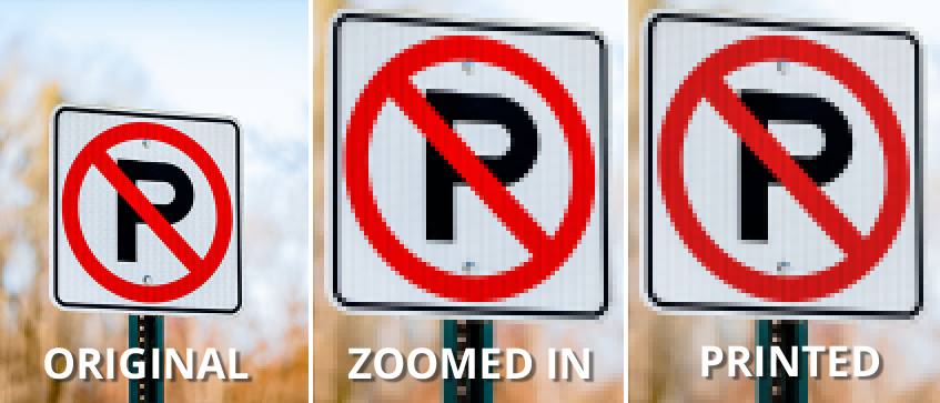
Picture B (300dpi)
This piece has hopefully highlighted the importance of ensuring a minimum of 300 DPI for all images used in artwork submitted for printing. By following the steps that we set out, you can ensure a satisfactory outcome for any printing job. If you are looking for professional printing services in Singapore, why don’t you try out Gogoprint! They can help you deliver great quality printed products you are looking for. Happy printing!