Are you looking to print something with Gogoprint and want to truly maximise the quality of the final product? Well, the Gogoprint blog is definitely the right place to master the art of artwork closing!
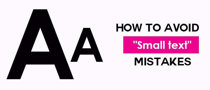
One important artwork closing aspect that we have not yet covered in detail on the blog, is the configuration of small/thin elements in your artwork. All customers need to be aware of small text requirements as it is likely to affect the quality of your final print if not adhered to (especially if you want to print anything with very small text / lines).
“Why should I care?”, you might be thinking…
Well, let me give you a bit of background so you can appreciate the issue at hand. With offset printing, there are small and inevitable variations of 2 to 3 tenths of a millimeter for every printed element (perfection is an illusion). This is due to the mechanical operation of the printing presses. For large and medium-sized elements, this change is likely to go unnoticed.
However, when dealing with smaller items, such as fine lines and text with a size smaller than 8 points, the difference might become more visible and lead to loss of readability and blurriness. Who wants blurry prints? No one!
Now that you are aware of the potential risks associated with small and delicate printing jobs, here is how to avoid any complications. First of all, it is wise to avoid using more than 2 colors for the composition of small elements
Here is an example of what can happen:
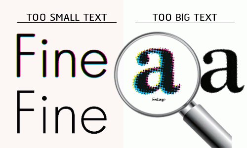
Composing your small text using 4 colors can seriously undermine legibility (and it just looks bad), while only one color makes the letter crisp and clean (maximising the reader’s experience...which we assume is your intention).
If you insist on using fine lines (thickness less than 2 points), which we fully understand because they are very useful and aesthetically pleasing, this very same logic applies.
So if you do really really want a thin brown line on your prints, we would advise against it since it requires at least 3 colours to make brown (cyan, magenta and yellow). Using 3 colors will likely result in an undesirable final print. It is our aim to avoid such mishaps, so we would advise you to use only 2 or less colors for such thin features.
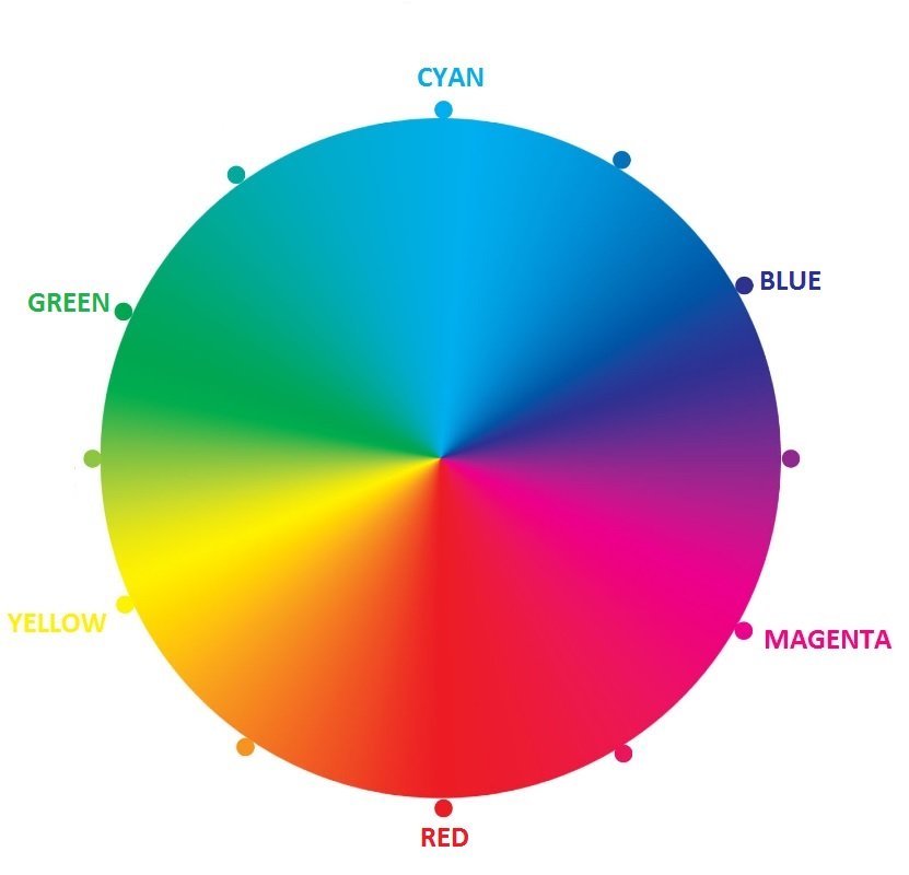
Here are some great options: The Colour Wheel (you might remember this from your early school years)
○ Keeping in mind that we are talking about CMYK print settings (which are the right setting for any printing job), this colour wheel might look a little bit different to the one you remember from back in the day
○ You can create numerous great colours using different compositions of just 2 colors
a) CYAN & MAGENTA
b) YELLOW & CYAN
c) MAGENTA & YELLOW
Alternatively, if you are dead-set on using a color requiring more than 2 colors during the printing process (you must really love the color brown), then simply increase the font size or thickness of your desired feature (thickness of 3 points or higher).

