


Advertising is a very important marketing-communication tool in terms of promoting products and services to become more well-known to customers and business groups. It encourages customers to be more interested in products and services, and motivates customers to buy by embedding itself into the minds of the customers. The more customers see the ads, the more likely that the customers will buy or use the service that they see in the ads.
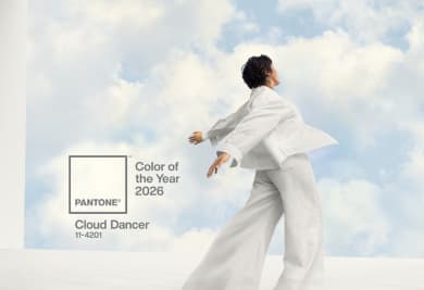
Advertising can be divided into different categories depending on the approach that is being looked at (e.g. online vs. offline, outdoor vs. indoor, etc.). For this blog article, the focus will be on “posters”, a type of offline-advertising that is still popular today. Posters are often used to promote different events such as music festivals and sales event.
With that said, we have gathered 5 important tips for poster design to help you design posters more effectively and easily. A good poster needs to provide information that is well-informed and attractive to the customers.

1. Five crucial elements
A good poster must consist of 5 elements:
- A Catchy Headline to catch people's attention.
- A Strong Sub-Headline to reinforce the headline and provide some context.
- Details to inform the content and the date of the activity.
- Pictures to decorate the poster and make it visually appealing.
- Contact information for people interested in the event to reach out to you.

2. Emphasis
It creates a central point that draws the attention of customers and enables the recipients to fully understand the information. In general, the emphasis of the poster should be its headline, comparable to an important topic that helps people understand what the content of the poster is.

3. Font size
This is what makes posters stand out by using different font sizes to sort out the importance of each piece of information. To further explain, the headline should have the largest font size to make it easy to read and understand the general content of the poster. The sub-headline should be smaller than the main headline so that it is not too pronounced, and instead, it will be used to expand the headline. Finally, the information that follows the headline and sub-headline should have the smallest font-size since it is the longest in length by content, with the aim of giving the customer complete information.

4. Color and tone
In terms of color and tone, the thing to be considered is the brand and product image. For example, if a company deals in education, the poster should have simple colors and not be too flashy. This is to create trustworthiness and reliability. Do keep in mind that the color of the font and background should be in contrast to ensure that customers can easily read the content on the poster.

5. Balance
A good poster must have a good balance of all elements presented on the poster. The balance helps readers feel comfortable and read the information smoothly by arranging the elements properly and in proportion. As an example, the image of the poster must have a size that is not large enough to cover the message.
And there you are! These are our "5 tips to design powerful posters." We hope that you enjoy reading our article. Happiness is only real when shared! So, do not forget to share this article with your lovely friends. Come back again for the next article.