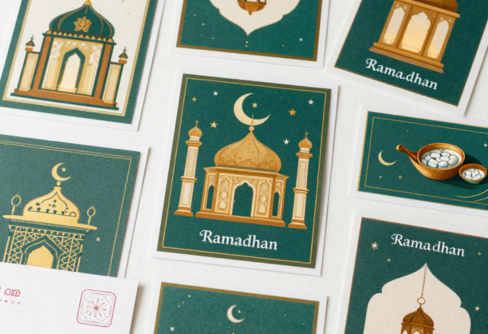


Outdoor advertising is growing fast these days (says global intelligence firm Nielsen), and as such it deserves some special attention. The poster constitutes one of the oldest forms of marketing/advertising, and can be found literally anywhere. Everyday, we encounter multiple posters multiple times a day, in multiple places. Posters are so widely used because they represent a versatile advertising medium, that offers a lot of creative liberties, has effective coverage, and can be used selectively to target the right audience. Posters need to be eye-catching, and attract passers-by’s attention, but also give a clear impetus for action! You need your target audience to take a certain action, and therefore the design and content of your poster needs to be particularly convincing.
So, how should I design my posters then?
The most crucial step in shaping the success of your advertising campaign lies at the very beginning of the process. Before imagining and designing your poster, sit down with your design and marketing teams and think about these elements:
○ Who is your target audience? How, when, and where is it best to reach them?
○ What is the key message that you want to convey to this target group?
○ Which visual elements and calls-to-action are likely to reinforce this message?
Depending on whether you want to advertise indoors (let’s say in your building’s elevator), or outdoors (for instance at a bus stop), it is important that you pick the appropriate format and paper weight for your posters. For indoor posters surrounded by a carrier material (typically a frame), a smaller format such as DIN A3, as well as thinner paper (130g, matt or glossy) will often suffice to reach your goal. For outdoor advertising, the most common sizes include DIN A2 and up, while they are printed on thicker paper (like 190g or 210g paper, matte or glossy). For more information, read our blog post on standard formats and their dimensions. Refer to our blog post on paper weight and refinement types to figure out what you need.

From a design and content perspective, here’s what you need to keep in mind:
Less is more!
It has been found that posters are viewed for an average of about 3-5 seconds, so this means that you need to focus on high-impact content and avoid information overloads. Do not include more than 5 impact elements in your poster, to make sure that your poster does not distract customers from what you want them to do.
Headline and subline:
Viewers must be able to read and understand your poster’s message within 3 seconds, so don’t waste your time on adding loads of text. Instead, focus all of your effort on the headline and subline to make them as impactful as possible. Limit your headline to a length of 5 words maximum, and try to make it fit on one line. Sublines should be used to make some statements that are part of your marketing message. Finally, to make sure that your poster is understandable from a distance, set the font size of your headline so it occupies about 15% of the poster’s height.
Your logo:
Viewers of your posters need to directly associate the main message with your brand. As a result, your logo should be well positioned and dimensioned. Viewers’ eyes tend to dwell on the top right of posters, and placing your logo there will increase the likelihood of brand association and recall.
Your text:
As we mentioned before, less is more, so make sure that your statements go straight to the point. Do not use complicated wording, long combinations, or filler-words, but make your text as memorable, persuasive, and natural as possible. Arrange your text blocks in an intuitive way, and ensure that your key message occupies the central position.
Use of fonts:
As we discussed in our blog post on the use of fonts in your artwork, fonts are decisive and can make or break your posters. Your choice of font will not only directly impact the readability of your poster, but also shape the image that readers will have of your brand. You have to make sure that the font you use is in line with the message that you try to get across. In addition, do not use more than 3 different font sizes in the same poster, otherwise its text will end up confusing viewers.
Images, and product images:
The most visual elements of your poster (images and compositions) need to be clear, bold, and prominent. Images that work best are clear, capture the viewers’ imagination, and leave them with positive and pleasant emotions. We recommend you to design a captivating and visually impressive composition that immediately catches viewers’ eyes, and exemplifies one of your product’s key selling points, or one of the situations it aims to solve. As for size, aim for an image/composition that occupies about 40% to 50% of your poster’s height.
Colours and contrasts:
Adding some color and contrast is the easiest way to insert some life and stimulus into your poster. However, don’t make overwhelm viewers with too many colors and too strong contrast, as your aim should not be to physically hurt their eyes. When designing your poster and choosing its colors, think not only about your brand, but also the environment in which you want to hang your poster. It is key that you find an original and visually appealing to differentiate your poster from the crowd of posters hanging around town.
What are your ideas of powerful posters? Feel free to share them in the comments section.
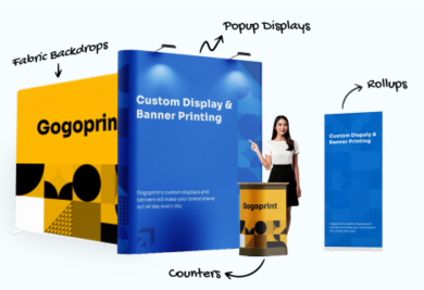
Try to apply these recommendations when designing your next posters, and don’t forget to print them with Gogoprint ;)