


What Is Pantone?
Pantone has been the leading authority and provider of professional colour language standards for the print and design industries, providing a universal colour language used by designers, brands, and printers worldwide. What started as a one-off marketing idea at Pantone in 2000 turned into an annual worldwide cultural and commercial debate whenever Pantone Colour of the Year gets announced.
2026 Pantone Colour of the Year
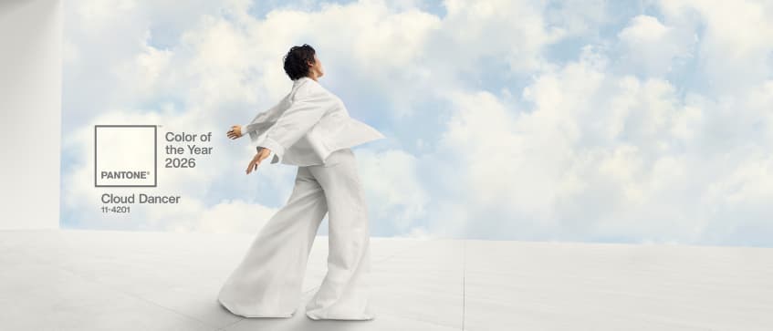
Image by Pantone LLC. All images sourced from Pantone media kits, 2026.
So when 2026’s Pantone Colour of the Year was announced to be Cloud Dancer, which is a light, off-white shade, it rightly sparked controversy and some heated discussion. Pantone describes Cloud Dancer as a “billowy white imbued with serenity that encourages true relaxation and focus, while serving as a symbol of calming influence in a society rediscovering the value of quiet reflection”.
This particular hue is simply white, in contrast with Mocha Mousse the warm brown hue for Pantone Colour 2025, seems to be devoid of colour or just plain boring as described by some harsh critics. Some even say white is not even a colour but a lack thereof. On the other end, supporters likened Pantone’s decision to a full reset, especially in the current climate full of political chaos and digital noise, it’s a calming and neutral influence.
Pantone Colours as a Print Marketing Trend in 2026
Pantone colours are no longer just a reference for designers– but have become a key print marketing trend shaping how brands stand out. As competition for attention increases, businesses are rethinking how colour is used in printed materials, shifting away from overly saturated visuals toward intentional, subtle designs that communicate clarity and confidence.
In print marketing 2026, this trend is shifting towards
-
Strategic use of white space and light colour palettes
-
Colour choices that support readability and communicate clear hierarchy
-
Designs that are brand-focus instead of campaign-heavy
What Does This Means for Printing?
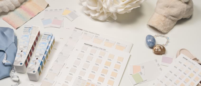
White space is a long valued commodity in design and part of it is to allow for the design to breathe. So while this hue surprisingly has many fans in the design community, what does this mean for the print industry? Extremely light colours or pastels shades have always been difficult to replicate in print, especially in digital prints that use CMYK. So with Cloud Dancer and its supporting pastel colour palettes, this can be hard to produce. Pantone colour printing requires precise management to produce and for smaller prints that use digital printing with CMYK colour profiles, it can be hard to match on-screen expectations and avoid Cloud Dancer turning to a plain grey or flat white.
Tips to Use Cloud Dancer in Printing & Marketing
However this doesn’t make Cloud Dancer unusable in print. This soft, airy shade works best when used with intention– supporting your main visuals rather than being the main focus colour. In printing or marketing, Cloud Dancer shines best when it enhances clarity, elevates design and creates breathing space for your brand or message.
1. Use Cloud Dancer as an Accent Colour
Cloud Dancer excels as a supporting tone in a design rather than the dominant colour. Use it to highlight borders, icons or secondary colours. In print, it helps soften bold brand colours and create visual balance– especially effective for corporate marketing materials and event collaterals. Or work with complementary colours – warm neutrals like sand, oat, and clay to create a sophisticated palette for that quiet, luxury aesthetic.
Tip: Pair it with strong contrast colours (deep navy, charcoal, forest green) for an energetic, premium vibe without being oppressive.
2. Turn It in Limited-Edition Merch or Packaging
Using Cloud Dancer in limited-release packaging or merchandise is a subtle way to celebrate design trends without a full rebrand. Think exclusive gift boxes, packaging sleeves, envelopes or thank-you cards that signal awareness in design trends yet keep your core brand colours intact. This works great for seasonal campaigns, brand anniversaries or creative launches especially for marketing or branding companies that would benefit best from staying ahead of current design trends.
3. Use It as a Texture or Pattern in Prints
Being minimalist at its core, it’s meant to evoke calm, soft, and neutral energy. Thus utilizing it as a texture or pattern helps avoid the design feeling flat or overly sterile. Cloud Dancer works especially well with soft patterns, subtle overlays or fine lines to preserve visual breathing space and add depth to a design. These subtle effects translate well in print as they are not meant to be a focal point. Instead, they support the overall message, making minor print variations less noticeable and easy to accept.
4. Feature It in Email Marketing
If Cloud Dancer doesn’t fit in your current printing collaterals, consider featuring it in your digital marketing instead. Elevate your email marketing with a ‘quiet luxury’ aesthetic and use Pantone Colour of 2026 in newsletter headers, section backgrounds or product showcases to enhance readability. It can also be paired with bold colours for CTA buttons or headlines, acting as a soft grounding base to enhance contrasting colours without overwhelming the reader.
5. Apply It to White-Heavy or Minimalist Designs
Cloud Dancer is a natural upgrade from plain white. As 2026 design trends move towards material depth and sensory minimalism, it’s especially effective in designs where white space is key– such as minimalism, quiet luxury and nature-inspired designs. This warm white hue adds intention and depth to designs while keeping layouts clean, modern and professional.
Conclusion
Pantone’s Cloud Dancer shows that subtle, restrained colours can still make a bold impact in print marketing when used thoughtfully. While light shades and pastels are challenging to produce in print, using Cloud Dancer strategically– as an accent, texture, exclusive packaging or even part of digital marketing– can enhance your brand’s visuals and adds a modern, minimalist feel. In 2026, the trend is clear, strategic colour and minimalist designs triumph over boldness.
Bring Cloud Dancer to your brand with Gogoprint Singapore. Contact us for custom print services that match your vision and perfectly showcase this subtle yet striking shade.